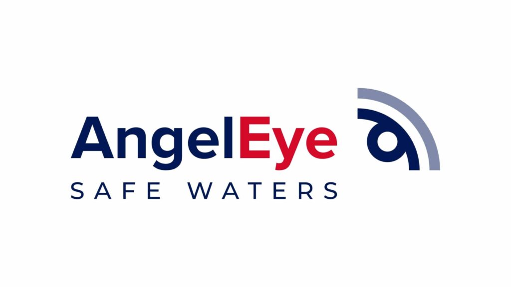
An angel, a watchful eye and protective shield: these icons merge into a new distinctive symbol as AngelEye, a global leader in the production, supply, and installation of systems and technologies for safety and monitoring in swimming pools, unveils the result of its much-anticipated brand restyling.

Starting with a thorough analysis of the existing logo, critical points were identified that needed an update to maintain relevance and improve effectiveness. Among these, the presence of unfavorable color harmonies, a rigid font, and a non-geometric pictogram pushed toward a necessary transformation.
The outcome? A refreshed logo that embodies AngelEye’s core values: protection, modernity, and clarity. The new pictogram, composed of rounded geometric shapes evoking both the vigilant eye and the guardian angel, symbolizes the brand’s ongoing commitment to water safety. Furthermore, the product design, represented by a series of circles, harmoniously blends with the concept of protection offered by the shield.
A color variation, reduced from four to three more balanced and harmonious shades, gives the logo an immediate visual impact, while the font change adds greater legibility and modernity to the brand. The extended AngelEye logo presents a balanced composition, including the icon, logotype, and the tagline “SAFE WATERS,” ensuring better distribution of elements in space and greater visual clarity.
This new visual identity not only reflects the evolution of the AngelEye brand but is also highly versatile and responsive, adapting to a wide range of media and communication contexts.
“This restyling of our logo marks a significant step in our journey to offer advanced and modern safety solutions”, says AngelEye CEO Andrea Marcato. “We are thrilled to introduce this new visual identity that embodies AngelEye’s commitment to water safety.”
The new AngelEye logo will soon be visible on all communication materials and will stand as a hallmark of the brand’s ongoing commitment to safety and innovation in the industry.


